Tailwind Variants


สวัสดีครับเพื่อนๆ วันนี้ผมจะพาเพื่อนๆทุกคนมาทำความรู้จักกับ Tailwind Variants กันครับ
What is Tailwind Variants
Tailwind Variants คือ first-class variant API library สำหรับ Tailwind CSS ซึ่งก็คือเครื่องมือที่ช่วยเราจัดการคลาสของ Tailwind CSS ให้เป็นระบบและระเบียบมากขึ้นครับ โดยเฉพาะเวลาที่ components มีหลายรูปแบบ (variants) เช่น หลายขนาด หลายสี และที่ถูกเรียกใช้ซ้ำหลายๆครั้ง
The Problem Without Tailwind Variants
ปัญหาที่เรามักพบเจอหากไม่ได้ใช้ Tailwind Variants และถึงเวลาที่ Project ของเราเริ่มมึขนาดใหญ่ขึ้น และมี components เพิ่มมากขึ้นได้แก่
- className เริ่มมีความยาวขึ้นมาก ทำให้โค๊ดอ่านยาก
- style ของแต่ละ component มีความซ้ำซ้อน โดยมีค่าแค่ที่ต่างกันเพียงไม่กี่อย่าง เช่น สี หรือ ขนาด แต่ยังคงต้องเขียน className อันใหม่ ยาว และซ้ำกันที่ไปมาทุกครั้งที่ต้องการใช้ components ที่คล้ายกับอันเดิมที่เคยเขียนไว้แล้ว
- หากเราต้องการแก้ไข style ของ components ประเภทเดียวกันทั้งหมด ยกตัวอย่างเช่น Button, Card หรือ Aside ที่กระจายอยู่หลายที่ใน project เรา ทำให้เราต้องตามหาและตามไปแก้ในทุกจุด ทีละอันจนหมด ซึ่งทำให้เสียเวลาและมีโอกาสที่เราอาจจะลืมแก้บาง components ไปได้
How Tailwind Variants Helps
Tailwind Variants จะช่วยจัดการปัญหาเหล่านี้ด้วยการทำให้การจัดการสไตล์เป็นแบบ declarative และรวมศูนย์ไว้ในที่เดียว
ข้อดีของ Tailwind Variants ก็คือ
- แยก Logic ออกจาก Style ได้อย่างชัดเจน ทำให้โค๊ดอ่านง่ายขึ่น
- มี type safety สามารถใช้งานร่วมกับ TypeScript ได้ดี
- แทนที่เราจะสร้าง component หลายอัน (เช่น
<ButtonPrimary />,<ButtonSecondary />, …) เราสามารถสร้างแค่ component เดียวโดยใช้ variants (e.g.,<Button variant="primary" />) และ reuse ได้ในทุกๆที่
Basic Examples
ตอนนี้ทุกคนได้รู้ข้อดีของ Tailwind Variants ไปแล้ว ผมจะมายกตัวอย่างวิธีใข้งานและเปรียบเทียบให้ดูระหว่างสถานการณ์ที่เราใช้และไม่ได้ใช้ Tailwind Variants ให้ดูกัน components ที่ผมจะสร้างให้ดูเป็นตัวอย่างครั้งนี้คือ Aside ครับ หรือบางคนอาจเรียกว่า Callout
หาก project ของเพื่อนๆยังไม่เคยติดตั้ง Tailwind CSS ต้องติดตั้งก่อนด้วยนะครับ ไม่งั้น Tailwind Variants จะไม่ทำงาน เราจะมาเริ่มจากการจะติดตั้ง tailwind-variants และ tailwind-merge ลงใน project ของเรากัน และผมจะขอใช้ icon จาก lucide-react ด้วยครับเพื่อความสวยงาม
bun add tailwind-variants && bun add tailwind-merge && bun add lucide-reactExample With Tailwind Variants
ตัวอย่างที่ใช้ Tailwind Variants
ButtonVariant.tsx
import type { FC } from "react";import { tv, type VariantProps } from "tailwind-variants";
const button = tv({ base: "font-semibold text-white text-sm py-1 px-4 rounded-full active:opacity-80 hover:cursor-pointer", variants: { color: { primary: "bg-blue-500 hover:bg-blue-700", secondary: "bg-purple-500 hover:bg-purple-700", success: "bg-green-500 hover:bg-green-700", }, },});
type Props = { text: string;} & VariantProps<typeof button>;
const ButtonVariant: FC<Props> = ({ text, color }) => { return <button className={button({ color })}>{text}</button>;};
export default ButtonVariant;base คือการประกาศค่า default ของ style นั้นๆ ซึ่งเวลาเรานำ component นี้ไปเรียกใช้ ไม่ว่าเราจะเลือก color เป็น “primary”, “secondary” หรือ “success” style ของ base ก็จะติดมาด้วยเสมอ
จะเห็นได้ว่าในโค๊ดนี้นั้น
- แยก style ออกมาอีกส่วน ทำให้โค๊ดของเราอ่านง่ายขึ้น
- Type-safe และ มี auto complete เมื่อต้องการเลือก color ตอนนำไปเรียกใช้
App.tsx
หลักจากนั้นเราก็ import เข้ามาใช้งานได้เลย
import "./index.css";import { Aside } from "./components/Aside";
export function App() { return ( <div className="flex gap-4"> <ButtonVariant text="Submit" color="success" /> <ButtonVariant text="Confirm" color="primary" /> <ButtonVariant text="Cancel" color="secondary" /> </div> );}
export default App;หน้าตาของ Aside components เราก็จะเป็นประมาณนี้
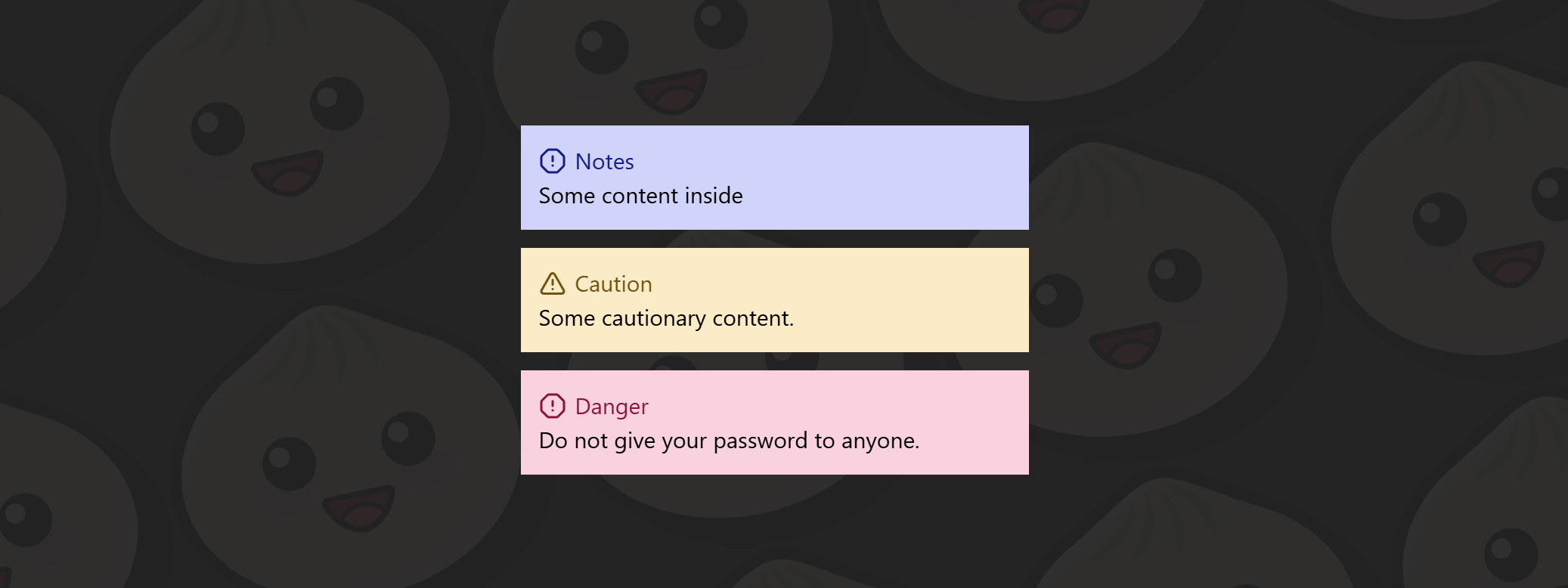
จะสังเกตได้ว่าในโค้ดที่เราพึ่งเขียนไปนั้น ถึงแม้ว่า Aside แต่ละแบบ (Note, Caution, Danger) จะมีความแตกต่างกันแค่ สี, icon และข้อความเล็กน้อย แต่เราจำเป็นต้องสร้าง component แยกออกมาเป็นหลายไฟล์ และต้องเขียน className ที่มีโครงสร้างคล้ายกันซ้ำไปซ้ำมา
ปัญหาที่เห็นได้ชัดจากตัวอย่างนี้คือ
- มี className ที่ถูกเขียนซ้ำในทุก component เช่น
w-full flex flex-col text-[20px] p-4 - เมื่อ component มีจำนวนมากขึ้น โครงสร้างไฟล์จะเริ่ม กระจัดกระจาย และดูแลยาก
- หากต้องการเปลี่ยน style กลาง เช่น เพิ่ม padding หรือเปลี่ยน font size เราต้องไล่แก้ไขในทุก Aside ทีละไฟล์ ซึ่ง เสียเวลาและมีโอกาสผิดพลาดที่เราอาจจะลืมแก้บางจุดไป หรือแก้ผิดไปบางอันทำให้ style ละจุดหน้าตาไม่ตรงกัน
- Logic ของ component ถูกผูกติดกับ style มากเกินไป ทำให้การ reuse และการปรับเปลี่ยนในอนาคตทำได้ยาก
ในตัวอย่างถัดไปเราจะได้เห็นว่า Tailwind Variants จะมาช่วยแก้ปัญหาพวกนี้ให้กับเราได้ยังไง
Example Without Tailwind Variants
ตัวอย่างที่ไม่ได้ใช้ Tailwind Variants
Button.tsx
import type { FC } from "react";
type Props = { text: string; color?: "primary" | "secondary" | "success";};
const Button: FC<Props> = ({ text, color = "primary" }) => { return ( <button className={`font-semibold text-white text-sm py-1 px-4 rounded-full active:opacity-80 hover:cursor-pointer ${color === "primary" && "bg-blue-500 hover:bg-blue-700"} ${color === "secondary" && "bg-purple-500 hover:bg-purple-700"} ${color === "success" && "bg-green-500 hover:bg-green-700"} `} > {text} {" "} </button> );};
export default Button;ในโค๊ดนี้เราไม่ได้ใช้ Tailwind Variants ทำให้
- className ยาวและอ่านยาก
- Logic ตรง color === ‘primary’ นั้นต้องมาอยู่ในส่วนของ tsx.
- ถ้าเราต้องการเพิ่ม variant ใหม่ เท่ากับเราต้องเพิ่มเงื่อนไขใหม่อีกด้วย
Tailwind Variants Slots Example
รอบนี้เราจะใช้ icon จาก lucide-react ด้วยครับ เพราะฉะนั้นเรามาติดตั้งกันก่อน
bun add lucide-reactCard.tsx
import { Layers } from "lucide-react";import { tv, type VariantProps } from "tailwind-variants";
const card = tv({ slots: { base: "grid grid-cols-12 w-md h-26 rounded-lg overflow-hidden mt-2 bg-white text-amber-950 border border-1 border-b-2 border-amber-950", rightSide: "flex justify-center items-center col-span-3", textContainer: "col-span-9 flex flex-col items-start p-4 justify-center", descriptionText: "font-bold text-2xl", }, variants: { bg: { blue: { rightSide: "bg-blue-400", }, green: { rightSide: "bg-green-200", }, orange: { rightSide: "bg-orange-200", }, pink: { rightSide: "bg-pink-200", }, }, },});
type CardVariants = VariantProps<typeof card>;
type Props = { title: string; description: string; icon?: React.ReactNode;} & CardVariants;
export function Card({ bg, title = "title", description = "description", icon = <Layers />,}: Props) { const { base, rightSide, descriptionText, textContainer } = card({ bg }); return ( <div className={base()}> <div className={textContainer()}> <p>{title}</p> <p className={descriptionText()}>{description}</p> </div> <div className={rightSide({ bg })}>{icon}</div> </div> );}
export default Card;จากในโค๊ดที่เราเขียนไป base คือการประกาศ style พื้นฐาน (ค่ากลาง) ของ component นี้ ซึ่งไม่ว่าเราจะเลือก variants แบบไหน style ของ base จะถูกนำไปใช้งานเสมอ ต่อมานั้นก็คือ variants นั่นก็คือหัวใจหลักของ Tailwind Variants ในตัวอย่างนี้เราสร้าง variant ที่มีชื่อว่า bg ขึ้นมาเพื่อควบคุมสีของ Aside เมื่อเราเรียกใช้ component นี้และกำหนดค่า bg="yellow" Tailwind Vairants จะรวม class จาก base และ bg: yellow เข้าด้วยกัน แต่ถ้าหากเราไม่กำหนดค่าbgเลย มันก็จะมีค่าเป็น blue เพราะเราได้บอก ค่า default ให้กับ Tailwind Varaints ไว้แล้วตรง defaultVariants:
จากโค๊ดที่ด้านบนที่เราเขียนไป จะเห็นได้อย่างชัดเชนเลยว่า
- เราไม่จำเป็นสร้าง components หลายอันและแยกไฟล์ออกเป็น 3-4 ไฟล์ เราสามารถรวมไว้ในที่เดียว
- โต๊ดดูสะอาดและอ่านง่ายกว่าเดิม เพราะมีการแยก logic กับ style ออกจากกัน
App.tsx
หลักจากนั้นเราก็ import เข้ามาใช้งานได้เลย
import { Book, GraduationCap, Inbox } from "lucide-react";import Card from "./components/Card";
export function App() { return ( <div className="flex gap-4"> <div className="flex flex-col gap-4"> <Card bg="blue" title="Total" description="40" /> <Card bg="green" title="Mastered" description="11" icon={<GraduationCap />} /> <Card bg="orange" title="In progress" description="21" icon={<Book />} /> <Card bg="pink" title="Not started" description="8" icon={<Inbox />} /> </div> </div> );}
export default App;หน้าตาของ Aside components เราก็จะเป็นประมาณนี้
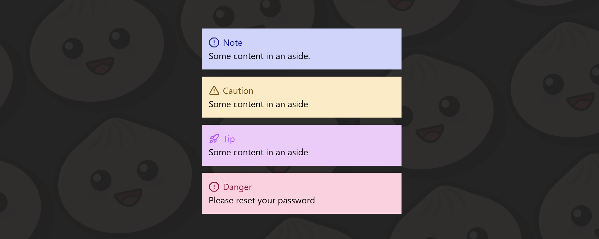
จากภาพด้านบนจะเห็นได้ชัดเจนว่า ตอนนี้เราสามารถสร้าง Aside ได้ถึง 4 รูปแบบ โดยใช้ component เพียงตัวเดียว ต่างจากตัวอย่างแรกที่ไม่ได้ใช้ Tailwind Variants ซึ่งมีเพียง 3 Asides และหากต้องการเพิ่ม Aside ใหม่ขึ้นมา เราจำเป็นต้อง
- สร้างไฟล์ component ใหม่
- เขียน className ซ้ำขึ้นมาอีกอัน
- และยังต้องไปเพิ่มเงื่อนไข
if / elseในAside.tsxอีกด้วย
ยิ่ง component มีจำนวนมากขึ้น logic และโครงสร้างของโค้ดก็จะยิ่งซับซ้อนมากขึ้นตามไปด้วย นอกจากนี้ หากในอนาคตเราต้องการแก้ไข style กลาง เช่น padding, font size หรือ layout เราก็ต้องไล่แก้ในทุก component ที่เราเคยสร้างไว้ ซึ่งทั้งเสียเวลา และมีโอกาสพลาดได้ง่ายมาก
ในทางกลับกัน เมื่อเราใช้ Tailwind Variants การเพิ่ม Aside ใหม่ทำได้ง่ายมาก เพียงแค่เพิ่ม variant เข้าไปอีกหนึ่งค่า เราก็สามารถใช้งาน Aside รูปแบบใหม่ได้ทันที โดยไม่ต้องสร้าง component ใหม่เลย และหากต้องการปรับ style กลาง ก็สามารถแก้ไขได้จากที่เดียว ส่งผลกับทุก Aside ได้ทันที นี่คือความแตกต่างที่เห็นได้ชัด
Conclusion
Tailwind Variant ช่วยลด duplication ของ className และ แยก logic ออกจาก style ทำให้โค๊ดเราสะอาด อ่านง่ายขึ้น และยังช่วยเราประหยัดเวลาจากการทำซ้ำไปอีก
หาก project ของเพื่อนๆ เริ่มมี component ซ้ำๆ หรือกำลังเติบโตขึ้นเรื่อยๆ Tailwind Variants คือเครื่องมือที่ควรลองอย่างยิ่งครับ แต่แน่นอนว่า สำหรับ component เล็กๆ ที่ใช้เพียงครั้งเดียว การเขียน className ตรงๆ ก็ยังเป็นทางเลือกที่โอเคครับ หวังว่าบทความนี้จะช่วยให้เพื่อนๆได้เห็นประโยชน์และข้อดีที่ได้จากการใช้ Tailwind Variants
Thank you🙏🏻
สำหรับใครที่อ่านมาถึงตรงนี้ ผมขอขอบคุณมากๆครับ หวังว่า Blog นี้จะช่วยให้ทุกคนรู้จักและเข้าใจ Tailwind Variants มากขึ้นนะครับ จริงๆ Tailwind Variants สามารถทำได้มากกว่านี้อีกครับ ใน Blog นี้เป็นเพียงพื้นฐานเพื่อทำความรู้จักเท่านั้น แต่ก็เพียงพอที่จำนำไปใช้ให่เกิดประโยชน์ได้ หากสนใจเพิ่มเติมสามารถไปลองอ่านเพิ่มเติมได้ที่ Documentation ของ Tailwind Variants นะครับ ขอบคุณทุกคนอีกครั้งครับ.